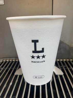
Japanese convenience store chain Lawson is steering an upgrade initiative, featuring their new 'L' logo on the store's cups. This is part of Lawson's branding strategy to bolster its identity in the robust convenience store market in Japan. Due to the sector's competitiveness, such moves are crucial for maintaining consumer presence and visibility. This news appears to have been announced recently, although exact details on when the initiative will begin were not disclosed.
Aptly calling them "convenience" stores may be an understatement as they are an indispensable part of daily life in Japan. An aspect that the Japanese people value, in particular, is the corporate branding manifested in a store's products and packaging. It's a way companies vie for consumers' attention and loyalty. The population's awareness and reaction to such changes often reflect how rooted these stores are in their day-to-day life.
In the US or EU, branding changes in convenience stores or supermarkets are also common, although perhaps not as salient due to the variety of retail options. However, logo redesigns or packaging changes typically signify a company's effort to stay ahead in the market, cater to an evolving consumer base, or align with eco-friendly trends.